How to Use the Psychology of Color for Your Interior Design

How to Turn 3 Basement Remodeling Ideas into Your Desired Space
October 2, 2018
A Simple, Remodeling Roadmap for People Who Loathe Planning Their Next Kitchen Remodel
November 17, 2018
Ever walk into any paint store and immediately feel overwhelmed with the thousands and thousands of color options that are available to you? This is when an interior designer by your side can feel like a life preserver in the middle of a vast ocean. It can seem like there are endless possibilities…to choose the wrong colors! But have no fear, we’re here to demystify your color selections and turn you into a color expert…well, at least knowledgeable enough to paint your bedroom the right color. Let’s dive into the psychology of color!
What is Color Psychology?
Color psychology is the study of the emotional and behavioral effects that color has on humans. It’s a study that many businesses are utilizing and benefit from, and you can too. Fast-food restaurants want to know what color will make you want to buy a double cheeseburger instead of a single. Music artists want to know what colors will catch your eye to buy their album, and online businesses want to know which color their website needs to be to make you stay longer and buy more. Although it’s possible to predict how most people will be affected by a particular color, your reaction will also depend on your individual experience. Maybe the dog that bit you as a kid had a yellow collar or the bike you fell off of and broke your arm was blue. Either way, color naturally affects us in many ways, and today we’ll be walking you through how to use this knowledge to select the perfect color for all the rooms in your house.
If you’re looking to find your perfect paint color you should check out our blog: 3 Ways to Pick the Perfect Paint Color
Red – The Color of Passion
Red is a color that known to increase blood pressure and heighten your metabolism. Think of some big fast-food restaurants: Wendy’s, Chick-fil-A, Papa Johns, Pizza Hut. They all have red as their primary color. With your heart pumping and your metabolism going you’ll order that Baconator instead of the salad for sure!
Like all colors reds come in various shades, and these shades can provoke different feelings and have varying effects. Light red brings joy, passion, love. Dark red causes rage, anger, and gives a sense of willpower, leadership, courage, and longing. Red is not a dull color and therefore is considered a great accent color. In the kitchen, red is a great color because of the effects it has on metabolism. The hungrier you are, the better the food tastes! Avoid red in rooms like the bedroom or bathroom, however. These areas are meant for relaxation and calming down after a long day. Red will make it harder to sleep, so you may want to avoid using it in your bedrooms.
Orange – Love it or Hate it
Orange is a very bold color, and many people either love it or hate it. Combining the energy of red and the happiness of yellow, orange is an excellent color for rooms like the kitchen or workout spaces. It promotes enthusiasm, fascination, joy, creativity, and determination. These are the reasons companies like Home Depot, Fanta, Master Cars, Reese’s, and Dunkin Donuts have incorporated orange into their logos. These companies want to encourage energy and enthusiasm. Dunkin Donuts sells energy in a cup, and Home Depot wants to support you and your determination to make your DIY home improvements.
Darker shades of orange can represent deceit or mistrust and should probably be avoided for interior decorating. Gold is the color of prestige and could be an excellent accent for things like bathrooms. Incorporate gold finishes to your faucet and hardware for a glamorous or luxury experience in your bathroom. Keep in mind, though a great accent color, orange be overpowering if used excessively.
Green – Namaste
Green is the most diverse color when it comes to how various the effects of its different shades can be. While most colors and their shades stay within the same family of feelings and emotions, green is all over the chart from calm and harmony to greed and jealousy. Bright greens, or spring green, is associated with growth, balance, freshness, and has a strong emotional response to safety and healing power and is beneficial to the mind and body. It can make someone feel confident and represent loyalty. It also has been known to slow human metabolism, and as a result, it produces a calming effect. Dark green is associated with ambition, greed, and jealousy. Aqua green has healing powers and gives the feeling of protection. Yellow-green, on the other hand, is associated with cowardice, sickness, and discord. Olive green is the color of peace.
Think about a few of the companies that use green in their logos. Starbucks uses a dark olive/forest green, Whole Foods uses olive green, John Deer and BP use a bright spring green, and Land Rover uses an olive green. These companies are trying to portray a feeling or an association with nature, peace, and harmony. Whether it’s in harmony with earth or other humans, these companies knew what they were doing when they selected their color schemes.
Unlike any other color, green will go great in any room of the home. In bathrooms, it can create a zen-like experience. In bedrooms, it can help you unwind and relax before sleep. In a kitchen, it can create the feeling of freshness.
Blue – America’s Favorite Color
Evidence has suggested that installing blue-colored streetlights can lead to reduced crime. So now I’m wondering why street lights aren’t blue, are you? Trustworthy, loyal, friendly, calming powers: blue is by far the most popular color in the United States. Associated with trust, confidence, truth, faith, intelligence, there isn’t a shade of blue that will evoke even the slightest bit of ill will or negativity. It has a calming effect and reduces metabolism and slows down our heart rate. Light blue can create a feeling of tranquility, healing, and softness. Dark blue is associated with knowledge, integrity, power, and seriousness. Deep blue can evoke the sense of luxury. Much like green, blue is an excellent color for almost any room in the home.
Many companies take advantage of the advantages of blue like Samsung, Ford, and Allstate. All these companies want you to trust in their product and feel safe in investing in them.
When blue is used in a bathroom, it creates a serene place to feel calm and at ease. In a bedroom, it can promote rest and a good night’s sleep. The kitchen is the cornerstone of a home and family gathering, and creating a kitchen with blue walls or blue accents can make a welcoming space to sit and relax.
Yellow – The Sunshine Color
Happiness, energy, and attention getter! Like red and orange, yellow is a reliable and powerful color that stimulates mental activity whether it be bad or good. Much like green, the wrong shade of yellow can be disastrous. For example, babies cry more in yellow rooms, and too much yellow can be disturbing to us. Dingy yellow can conjure up feelings of sickness and decay. People are also more likely to lose their temper in an all yellow room, so it should be used sparingly. Light yellow is associated with lightness, joy, and intellect and makes a great exterior color.
The company Life is Good uses yellow in their logo. They use the bright yellow shade that brings out emotions like happiness and increases energy levels that express the very positive outlook of their brand.
Too much yellow or the wrong shade of yellow can be a bad thing, but used as an accent color or an exterior color, yellow is an excellent option in many locations!
Purple – The Color of Kings
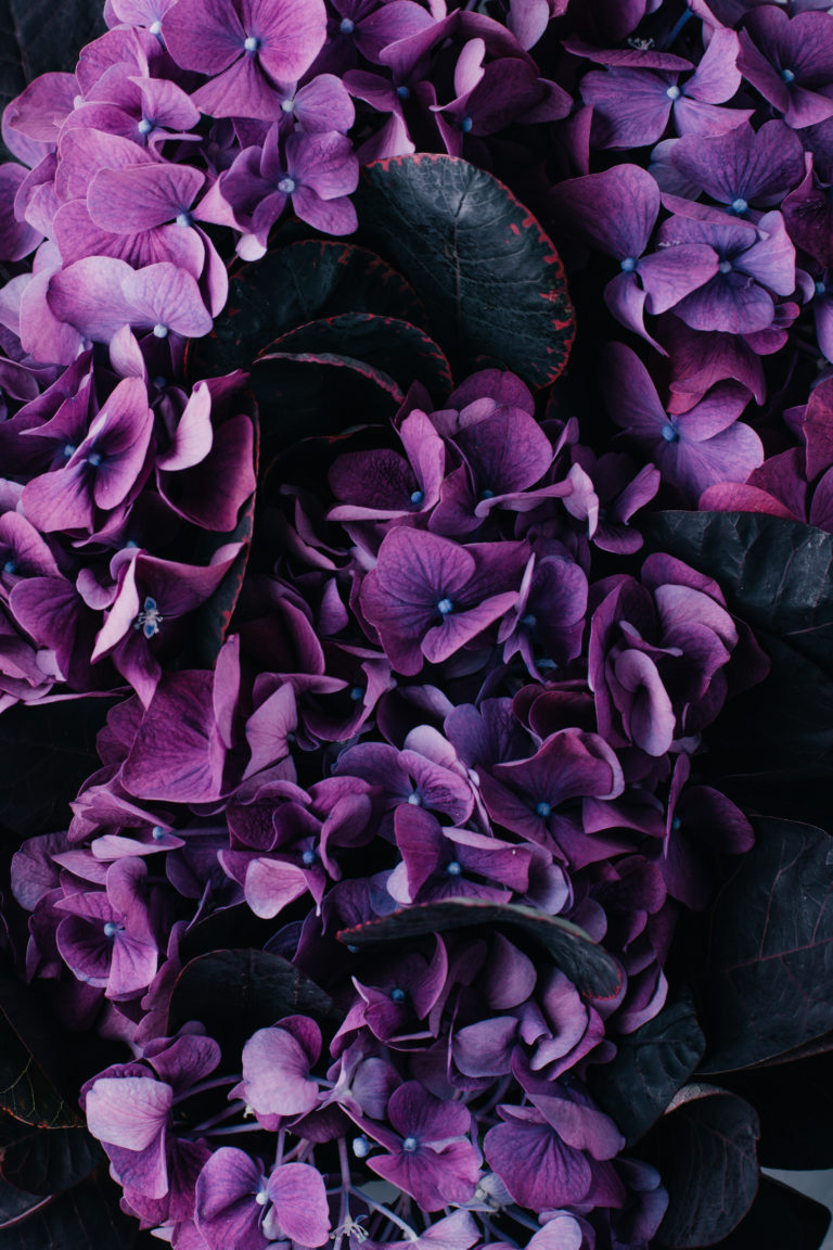
Purple combines the stability of blue and the energy of red. It brings forth thoughts of royalty, power, luxury, and wealth, and 75 percent of preadolescent children choose purple over any other color. This makes it a popular color for children’s rooms and the correct shade could make for a peaceful oasis for your kids. Adding purple can also lend drama to a room and combined with gray and pastel colors will give a hip-vibe. Lighter purple such as lavender can create a peaceful or calming effect on the occupants of a space.
Dark purple can make a beautiful accent color in a living room or bedroom, and lighter shades could work perfectly in a bathroom to create a spa-like feeling.
Hallmark uses a dark rich purple in combination with their gold crown logo to give a sense of importance and elegance to their brand.
Struggling to find your personal design style? Check out our blog: How to Figure Out Your Design Style: A 3 Step Process
Pink – Innocent
When you think of pink, the first thing that comes to your mind might be Barbie or any little girl toy aisle. That’s not just a coincidence and is driven by the fact that it is considered feminine, innocent, and nurturing. A soft baby pink can sometimes give a room the feeling of comfort, though maybe too much as a whole room color. Pink can be a great accent wall color for a children’s bedroom or playroom.
Black – The Power Move Color
Often black is seen as a color of “power.” Take a look at luxury car commercials and see how many of the cars featured in the commercial are black. People see the color black as sexy, powerful, mysterious, and even ominous. Throughout history, black has been the symbol of grief, but when paired with gold is considered more of an elegant look. Of course, we are not suggesting a whole room be painted black but think of companies like Chanel or Louis Vuitton. Accenting with black can be a power move, and give a space an elegant or luxurious feel. Combining it with white in a bathroom can provide a classic, timeless look. In a home office, it can evoke confidence and power. It’s a bold color, for bold people, just be cautious and discerning in how you use it.
White – Cleanliness is Next to Godliness
We can all agree that the cleanest color of them all is white. Nothing feels fresher than a white summer dress. White has been associated with cleanliness and purity for hundreds of years and it the reason wedding dresses and hospitals are white. The color is often used to evoke a sense of youth and modernity. Most modern or contemporary style home will have lots of white with accent colors. Lightness, innocence, purity, the color of perfection, safety, and cleanliness. These are all things that we feel when surrounded by white. It’s a great color for bathrooms and kitchens where being clean is of the highest priority. Just be sure to have an accent color to tone it down and bring life into it. Too much white can be blinding, intimidating, and frankly get a little boring and stark.
Gray – A Clean Slate
Classic and elegant, intelligent and disciplined. Gray is a psychological neutral and will play nicely with many accent colors. Using a warm gray can be inviting when combined with other warm colors. If you’re afraid of committing to a bold color like yellow, green, or blue; gray can be a great option to paint any space and allow the ability to accent with other colors. It’s a clean slate to spice up with furniture, fabrics, and lighting and will give you the flexibility to change your mind and change things up down the road. You might like purple this year, but you may fall in love with green next year. Keep your options open and opt for a neutral gray as a foundation.
Smart People Make Smart Choices
Our goal with these pieces is to help you get the information you need to make educated choices for your home and family. If you have found this helpful, or have questions or requests for other topics, please leave them below, and we will make sure you get the answers you need.
Benefit from our experience!
From inspired designs to caring craftsmanship, our team of friendly professionals will guide you through our unique process that ensures you will achieve your goals while keeping your sanity.
We are proud of our team and the beautiful work they do. Give us a call or email today and experience it for yourself. We would love to talk with you.

